
Dashboard
Dashboard report: overview
RedTrack Dashboard is a real-time reporting interface that provides a consolidated view of your ad performance metrics. It aggregates data from your campaigns, ads, and offers to give you an overview of key indicators such as:
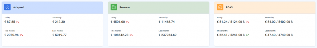
Ad Spend – tracks how much money you’re spending on paid campaigns over time.
Revenue – displays how much revenue your ads and campaigns are generating.
ROAS (Return on Ad Spend) – shows the ratio of revenue generated per €1 spent.
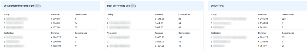
Best performing campaigns – demonstrates your most effective campaigns based on Revenue and Conversions.
Best performing ads – reveals which individual ads are bringing in the most money and conversions.
Best offers – identifies which landing pages or offers are converting best.
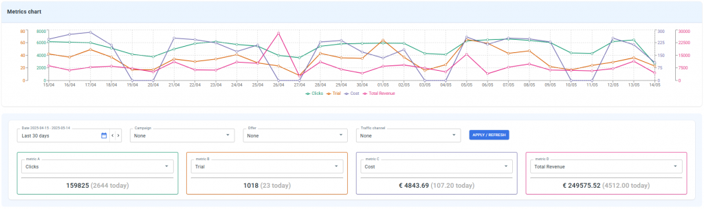
Metrics chart – visualizes trends over time (e.g., clicks, trials, cost, total revenue). Great for spotting patterns or identifying unusual spikes/drops.
The chart works based on the set metric filters (data/campaign/offer/traffic channel).
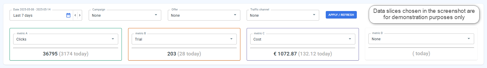
Working with the Metrics chart
1. Decide on the specific question/issue you want to cover (e.g., am I getting a good return on my ad spend?).
2. Set the filters accordingly → Apply / Refresh:
- Set the date range
- Apply the Campaign/Offer/Traffic channel filters if you want to narrow down the data to a particular campaign or source
- Choose the particular A-D metrics based on your needs
3. Read the chart:
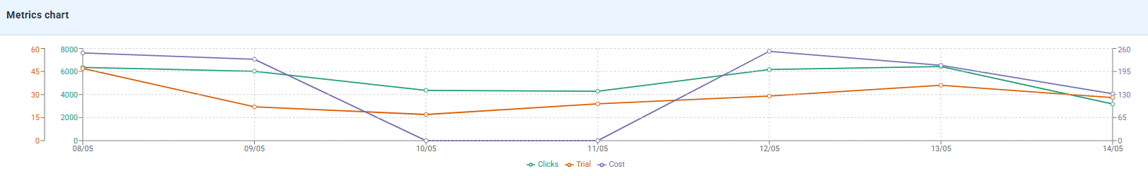
Based on the generated data from the screenshot:
1. Clicks are marked green.
They are stable, with a slight decrease from May 8 to May 14. That said, the line remains relatively high and consistent, indicating the campaigns are generating traffic.
2. Trial subscription is marked orange.
There is a drop from May 8 to May 10, followed by a gradual recovery. There’s probably a conversion issue.
3. Cost is marked blue.
It’s high on May 8-9, drops sharply on May 9-10, then spikes again on May 12 and gets stable after that.
All of it can be attributed to budget or campaign manipulations (pause/restart).
Conclusion: we should investigate low Trial conversions, look into budget-burning ad sets, and check for tracking issues.
Dropping revenue, but stable clicks → funnel issue. Possible issue with poorly converting landing.
Flat lines → possible data loss or tracking issues. It’s advised to check the setup.
Cost spikes, but no change in cost → budget issue.
Ignore one-day anomalies. Focus on patterns over several days.